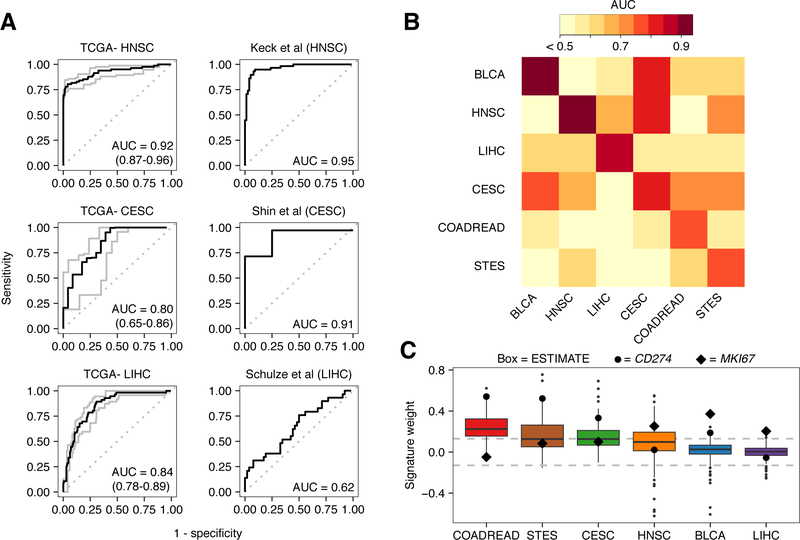
Figure 4: Performance and characterization of the virus infection gene expression signature.
A, ROC curves illustrating the accuracy of using the virus gene expression signature to classify infected samples from non-infected samples. Plots on the left depict the signature’s performance in training data while plots on the right depict the signature’s performance in test datasets. Gray lines and numbers in parentheses in the left plots indicate the 95% bootstrap confidence intervals of the ROC curves and their respective AUCs. From top to bottom, test datasets were obtained from GEO under accession numbers GSE40774, GSE49288, and GSE62232. B, Heatmap of AUCs for signatures trained in one tissue type (columns) and applied to another (rows). To show contrast, all AUCs < 0.5 were trimmed to 0.5. C, Boxplots depicting the weight of the gene MKI67 (black diamond), CD274 (large black circle) and the weight distribution of genes comprising the ESTIMATE immune gene expression signature (boxes). Dotted lines at 0.13 indicate threshold at which weights correspond to P < 0.05. Each box spans quartiles with the lines representing the median signature weight in each group. Whiskers represent absolute range excluding outliers. All outliers were included in the plot.

