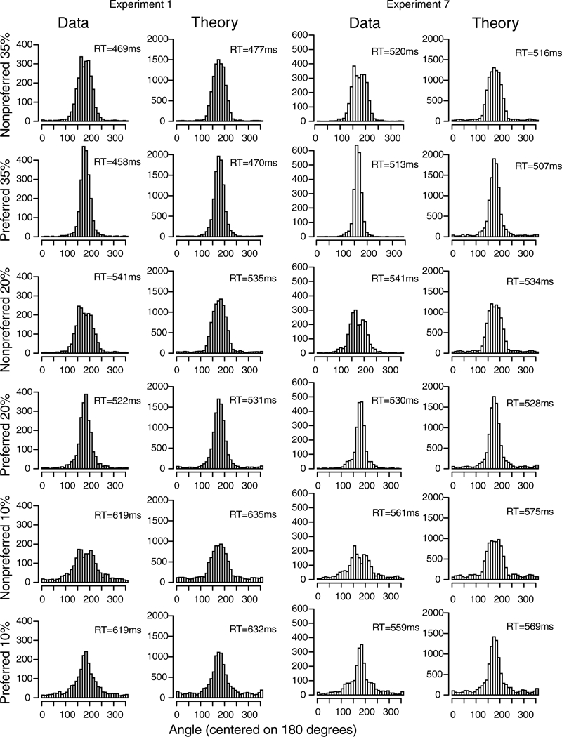
Figure 13.

Plots of the frequency of responses for responses centered on the primary and additive colors (“preferred” plots) and those between the primary and additive colors (“nonpreferred” plots) for all responses from all subjects for Experiments 1 and 7 for data and model predictions. Mean RTs are shown as insets. The data are shown for the two more difficult conditions because the easy condition does not show much difference between the two sets of plots. Results show the same kind of peaked versus flat response functions as shown in Figures 12A and B.
