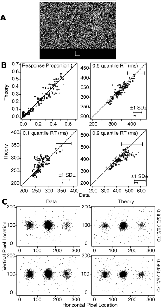
Figure 16.

A shows an example stimulus with three bright patches. B shows plot of response proportions and quantile RTs for theory plotted against data with error bars produced in the same way as for Figure 3. C shows plots of the data and theoretical predicted responses for all subjects for each condition with the data aligned with the strongest stimulus patch in the middle (100×180), the next strongest at 100×60, and the weakest at 100×270.
