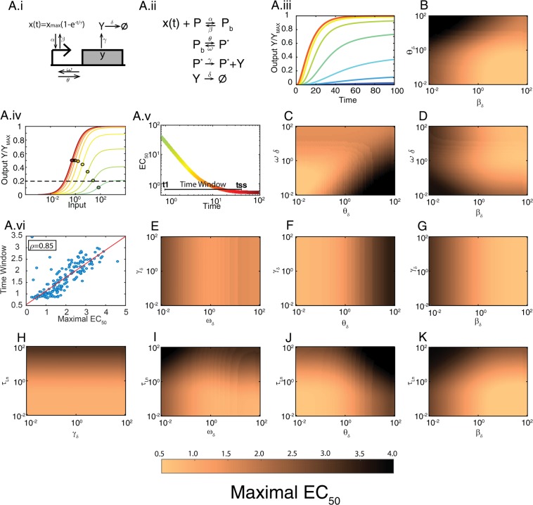
Figure 6.
Shifting in a gene expression model. (A.i) Diagram for transcription factor-mediated gene expression. X is the transcription factor; a filled rectangle represents gene y; the arrow pointing at the rectangle is the promoter region; α and β are the binding and unbinding rates of X to the promoter, θ and ω are the activation and deactivation rates of the promoter, γ and δ are the production and degradation + dilution rates for protein Y. (A.ii) Reaction scheme of the model. (A.iii) Output Y vs time for different inputs. (A.iv) Output Y vs input X (concentration of the transcription factor) for different times. For A.iii and A.iv Y has been normalized to its maximum (γ PT/δ). Filled circles over the curves mark the EC50. Here all kinetic rates are equal to 1 and the activation time of X has a τn = 10. (A.v) EC50 vs. time for the curves in (A.iv). Maximal EC50 (ME) is indicated with a horizontal dotted line in (A.iv), the Time window (TW) with a horizontal line in (A.v) The color scale indicates the time. (A.vi) Time window (TW) vs. Maximal EC50 (ME) for 200 randomly selected parameter sets out of the 104 total scanned (ρ = 0.8562, using all parameter sets) (see Supplementary Information for a description of the scanning procedure). (B–K) Each plot shows ME for 150 × 150 values of the indicated parameters (see TW in Fig. S2). In each panel, the rest of the parameters were equal to 1.

