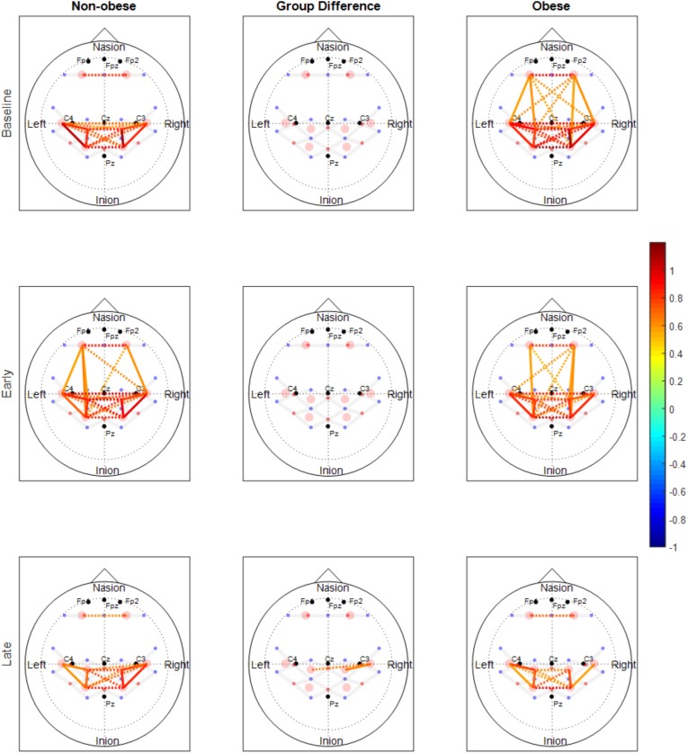
FIGURE 3.
Functional connectivity maps of non-obese (left column) and obese (right column) during the baseline and motor fatigue test. The connectivity maps are produced from the weighted matrix, and the color of each node depicts the strength of connectivity based on provided color scale. Nodes with solid lines indicate intra-hemispheric connectivity, and nodes with dotted lines indicate inter-hemispheric connectivity. Middle column shows the nodes which connectivity was significantly different between the obesity groups. The connectivity difference maps are produced from the binary matrix, and positive score based on the provided color scale indicates connectivity of the nodes were significantly stronger for non-obese than obese.

