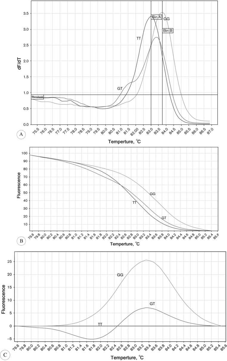
Figure1.
High-resolution melt (HRM) analysis melting curves.
A) Derivative data plots (-dF/dT vs. temperature): The melt curves peaked at the maximum dissociation rate on the basis of the Tm.
B) Normalized DNA melting curves: Comparison of the 3 genotype patterns was made possible by the normalization of these plots.
C) Differentiation curves: This graph displays the difference between each sample and a given genotype control and allows a calculated percentage confidence relative to a known genotype.
dF/dT, Derivative of fluorescence over temperature ; TT, T allele carriers; GT, G and T alleles carriers; GG, G allele carrier
Peak bins (A, B, and C), Bins are used to define the general area where we expect peaks to occur. The peaks of the curves close together were assigned to the closest bin.

