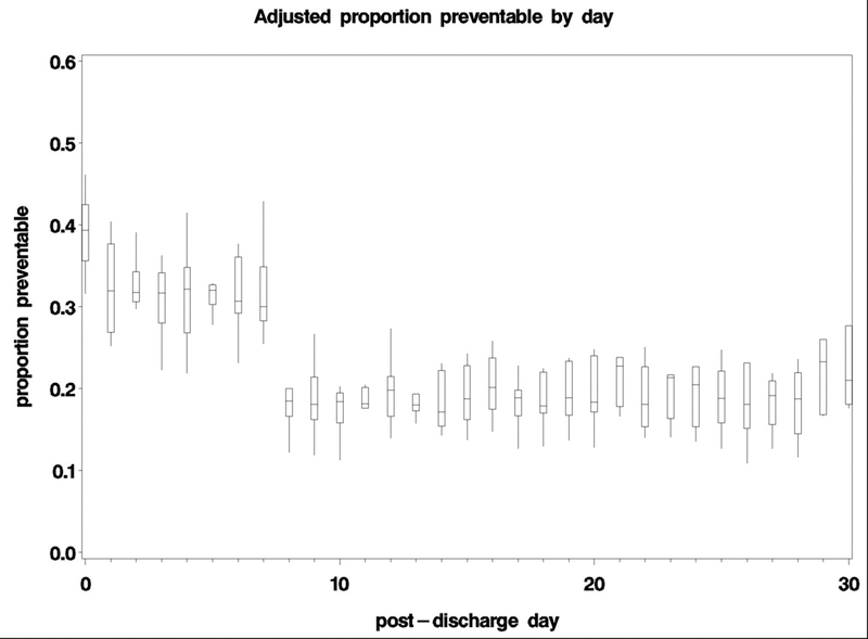
Figure 2:

Pooled, adjusted proportion of readmissions ascertained as preventable using a standard algorithm and physician adjudication at all ten hospital sites. The bottom and top edges of the boxes represent the pooled 25th and 75th percentiles, the center horizontal line is drawn at the 50th percentile (median), and the vertical lines represent the most extreme observations.
