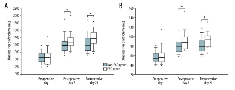
Figure 1.
Comparison of postoperative (A) absolute and (B) relative liver graft volumes of the non-EAD and EAD groups after living-donor liver transplantation. The box plots show the median (line in the middle of the box), interquartile range (box), 5th and 95th percentiles (whiskers), and outliers (dots). * p≤0.01, # p≤0.001.

