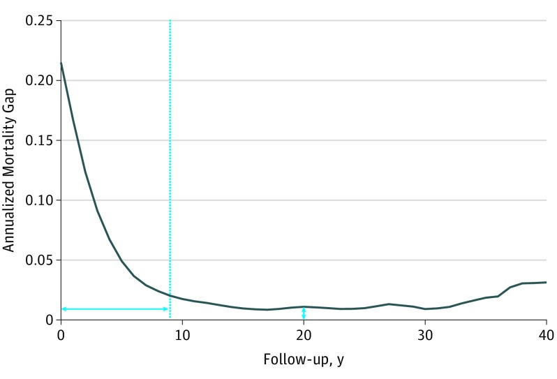
Figure 2. Annualized Mortality Gap Example: Ovarian Cancer.
Age- and sex-matched annualized mortality gap for ovarian cancer. The dotted line indicates the high-risk cutoff, and the horizontal and vertical double-headed arrows indicate the high-risk period duration and the persistent mortality gap, respectively.

