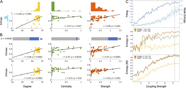
Figure 2.
Correlation between node entropy and 3 widely used topological metrics in the empirical and modeled data. These metrics are: Degree (Yellow), Betweenness Centrality (Green) and Strength (Red). (A) Scatter plots for correlations in the empirical average healthy control group with their corresponding distributions. (B) Significant subject-by-subject correlations between node entropy and all 3 metrics. Bars represent the percentage of corrected significant correlations (Bonferroni correction). Scatter plots represent 2 sample subject-by-subject correlations. (C) Behavior of the fitting, node entropy and correlations between node entropy and all 3 topology metrics as a function of the coupling strength. Top plot represents the fitting between the modeled and empirical FC (dark blue) as well as node entropy (light blue). Middle plot represents the Pearson correlation between node entropy and degree, betweenness centrality, and strength. Insert values represent the correlation at maximum fitting (dashed vertical line). Bottom plot represents the normalized (see Methods) mutual information (MI) between node entropy and degree, betweenness centrality and strength as a function of the coupling strength. Insert values represent the MI at maximum fitting.

