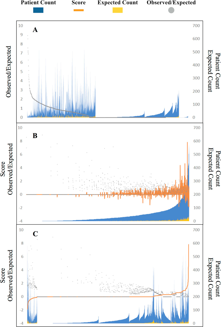
Figure 2. Distribution of clinician performance scores and corresponding patient cohort sizes among 2010–2013 clinicians.

Each x-axis position represents one clinician considered with blue peaks representing the number of patients whose treatment was attributed to the clinician. Figure 1A illustrates clinicians sorted purely by observed-to-expected patient mortality ratio (gray points). The raw ratio proves unstable as a metric. Nearly half of clinicians show a “perfect” ratio of 0, mostly due to small patient cohort size, and a small cluster of clinicians on the right show an undefined ratio when the expected death denominator is zero. Figure 1B sorts clinicians by total patient count attributed to them. The clinician performance score (orange curves) accounts for both effect size of observed-to-expected patient mortality as well as certainty in those rate estimates based on the quantity of patient data available for each clinician. Figure 1C sorts clinicians by performance score, illustrating that by design the majority of clinicians (72.2%, n=1315 of 1822) are left unstratified in the middle range with an Sj score of zero, largely given patient cohort sizes too small to draw statistically detectable conclusions. Only clinicians at the extremes who demonstrate substantial deviation from expected norms are stratified into low- and high-mortality cohorts.
