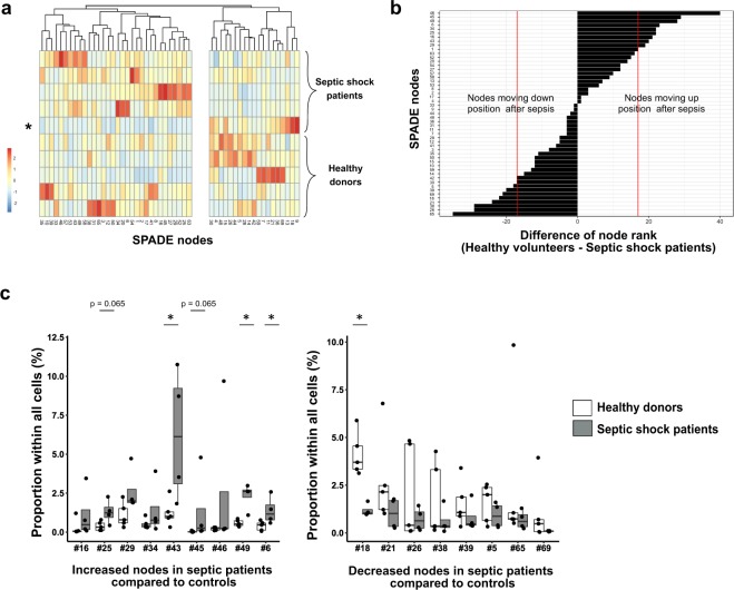
Figure 4.
Significant variations in node proportions are observed after septic shock. (A) For the 5 healthy donors and 5 septic shock patients, individual proportions of each SPADE node were plotted onto a heatmap. The red and blue colours indicate increased and decreased proportions respectively. Order of nodes was determined by non-supervised hierarchical clustering. On the right side of the heatmap were clustered nodes that seemed decreased in septic patients compared to controls. On the left side were clustered nodes that looked increased in septic shock patients. Septic patient presenting mHLA-DR > 20,000 AB/C and excluded from further analyses is indicated by a star. (B) To highlight SPADE nodes with important variations in cell proportions between healthy donors and septic patients, nodes were ranked by descending order according to their average proportions in controls (n = 5) and in septic shock patients (n = 4). The rank difference between healthy volunteers and septic patients was calculated and plotted for each node. A difference (controls - septic patients ranks) under 0 reflected a decrease of cell number within the node in septic patients, whereas a positive difference suggested an increased node proportion in septic patients compared to healthy donors. Arbitrary, proportion variation was considered non-negligible when a node’s rank differed more than 1/3 of total node number, reflecting a gain or loss of more than 17 positions (red lines). (C) Potentially increased (left plot) or decreased (right plot) nodes’ frequencies were plotted for septic shock patients (n = 4; grey boxes) and healthy donors (n = 5; white boxes) samples as boxplots with individual values. Node proportions between controls and septic shock patients were compared using Mann-Whitney tests. *p < 0.05.

