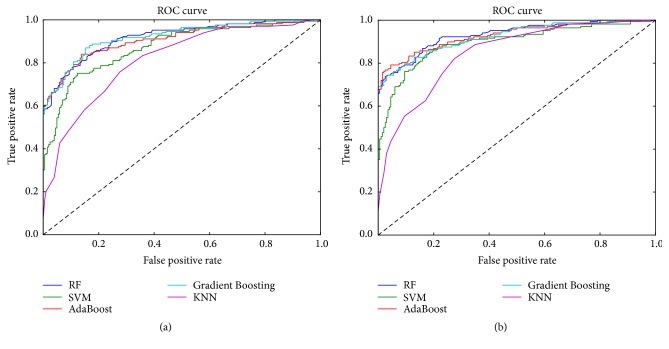
Figure 5.
The ROC curve in different model. (a) Data without noise reduction. (b) Data with noise reduction. The x-axis denotes false positive rate. The y-axis is true positive rate. In Figure 5, the dark blue line represents Random Forest (RF). The green line represents support vector machine (SVM). The red line represents Adaboost. The light blue line represents Gradient Boosting. The purple line represents K-nearest neighbor (KNN).

