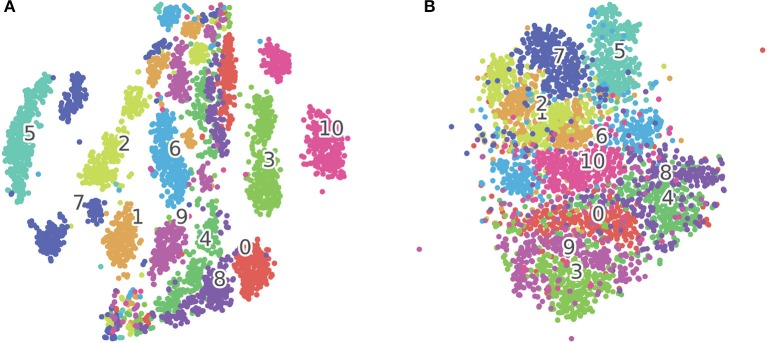
Figure 5.
(A) tSNE clustering for concatenated input vectors entering the SOM. (B) tSNE clustering for BMU trajectories output from the SOM. Each dot on the figure corresponds to one test sample in the TIDIGITS dataset, the numbers in the figure correspond to class centroids. The samples (e.g., Class 7 and 10) within the same class get closer after being processed by the SOM as shown in this 2D visualization.

