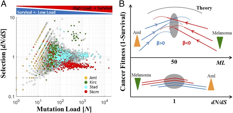
Fig. 6.
Empirical mutation-selection phase diagram of tumor evolution. (A) Mutation-selection empirical diagram for all analyzed cancers (gray) and selected cancer types (color-coded) that show distinct evolutionary regimes depending on the ML. (B) A schematic conceptual depiction of the emerging fitness landscape of tumors as a function of the ML (Top) and selection (Bottom). Dashed curves are theoretical, and solid curves are observed. Down-triangles (green) indicate purifying selection and up-triangles (orange) positive selection. The gray ovals show the critical area.

