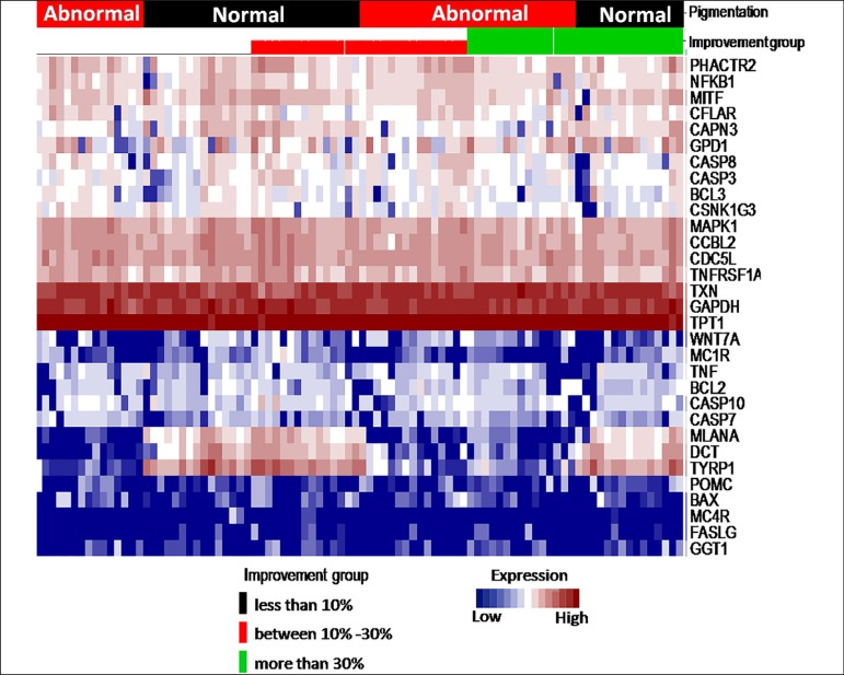
Figure 2.
Heat map of expression patterns grouped according to vitiligo type and disease improvement. At the top of the heat map, the following study groups are represented: type and subtype of sample according to pigmentation (black and red), and improvement (black corresponding to less than 10% improvement, red corresponding to 10%-30% improvement and green corresponding to more than 30% improvement). The vertical axis represents the expression patterns of the samples obtained for each of the genes (horizontal). The red color within the heatmap corresponds to over expression, while white corresponds to intermediate expression, and blue corresponds to sub expression

