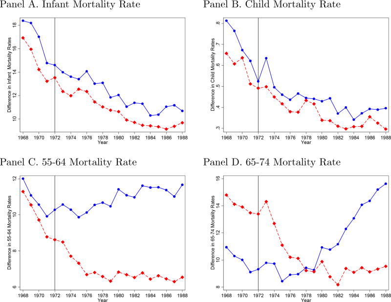
Figure I. Black-White Mortality Differences by Age and Sex.
Notes: The data are from the CDC compressed mortality files and represent the black-white difference in age-specific mortality rates. Each mortality rate is calculated by dividing the number of deaths in the relevant population by the at-risk population (in thousands). The solid (blue) line represents the difference for males, and the dotted (red) line represents the difference for females. The vertical line represents the year “The Tuskegee Study of Untreated Syphilis in the Negro Male” was disclosed. For additional figures, including plots of all other age-specific mortality rates and South only, see the Appendix.

