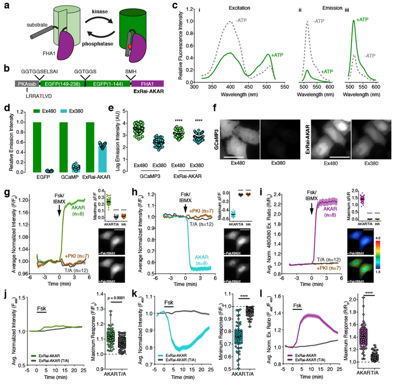
Figure 1. Design and characterization of ExRai-AKAR.

(a) Modulation of cpFP fluorescence by a phosphorylation-dependent molecular switch. (b) ExRai-AKAR domain structure. (c) Representative ExRai-AKAR fluorescence spectra collected at (i) 530 nm emission and (ii) 380 nm or (iii) 488 nm excitation without (gray) or with (green) ATP in the presence of PKA catalytic subunit. n=3 independent experiments. (d) Relative fluorescence intensities of HeLa cells under 480 nm (Ex480) or 380 nm (Ex380) illumination. n=63 (EGFP), 94 (GCaMP3), and 54 (ExRai-AKAR) cells pooled from 2, 2, and 11 experiments. (e) ExRai-AKAR is dimmer at Ex480 (****p<0.0001, t=5.228, df=136; unpaired two-tailed Student’s t-test) but brighter at Ex380 (****p<0.0001, t=8.826, df=136; unpaired two-tailed Student’s t-test) versus GCaMP3. Same n as in (d). (f) Representative GCaMP3 or ExRai-AKAR fluorescence images. (g-i) Average time-courses (left) and maximum (g) Ex480 or (h) Ex380 (ΔF/F), or (i) 480/380 ratio (ΔR/R) responses (right, top) in HeLa cells treated with 50 μM Fsk/100 μM IBMX (Fsk/IBMX). n=54 (ExRai-AKAR), 36 (ExRai-AKAR[T/A]), and 31 (ExRai-AKAR plus PKI) cells. Time-courses are representative of and maximum responses are pooled from 11, 4, and 4 experiments. ****p<0.0001, F=665.7 (d), F=3956 (e), F=1819 (f); DFn=2, DFd=119; one-way ANOVA with Dunnet’s test. Images show ExRai-AKAR (g) Ex480 or (h) Ex380 fluorescence, or (i) 480/380 ratio (pseudocolored) before and after stimulation. Warmer colors indicate higher ratios. Scale bars, 30 μm. (j-l) Average time-courses (left) and maximal (j) 488 nm- or (k) 405 nm-excited fluorescence, or (l) 488/405 ratio responses (right) in the soma of Fsk-treated cultured rat cortical neurons. n=57 (ExRai-AKAR) and 56 (ExRai-AKAR[T/A]) neurons pooled from 5 and 6 experiments. ****p<0.0001, unpaired two-tailed Mann-Whitney U-test. Curves are normalized to time 0 (g-i) or to the average baseline value (j-l). Solid lines indicate the mean; shaded areas, SEM. Bars in d, e, and g-i represent mean ± SEM. Bar graphs in g-i show box-and-whisker plots indicating the median, interquartile range, min, max, and mean (+). Maximum responses are calculated as ΔF/F=(Fmax-Fmin)/Fmin or ΔR/R=(Rmax-Rmin)/Rmin (g-i) or with respect to time 0 (F/F0 or R/R0; j-k). See Supplementary Table 1 for bar graph source data.
