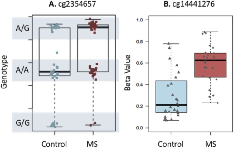
Figure 3.
Tukey box plot showing distribution of beta values for (A) a probe where the SNP is driving the methylation values and (B) the top LTA site from this study. The box plot shows the data within the interquartile range and the median is represented by a solid black line. Whiskers show maximum and minimum values. Grey bars indicate region for each genotype (homozygous allele 1 (1/1), heterozygous (1/2), and homozygous allele 2 (2/2)). Each point represents either an individual control (blue) or MS patients (red). Y axis shows β values.

