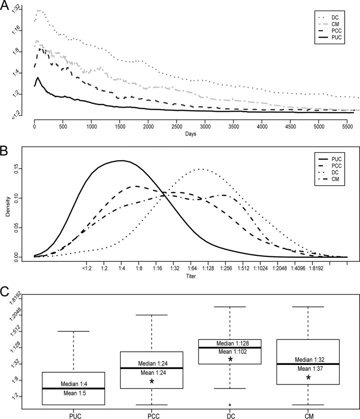
FIG 1.
Titer trends and maximal titers. (A) Average titer trend for each group. (B and C) Histogram density plot (B) and boxplot (C) of maximal titers for each group. The average maximal titers shown in panel A differ from the results calculated for panel C due to temporal synchronization required for visualization and interindividual variations in the time to maximal titer. Boxes represent the first and third quartiles. Whiskers represent 1.5 times the interquartile range. *, Student's t test, P < 4.7 × 10⁻⁶.

