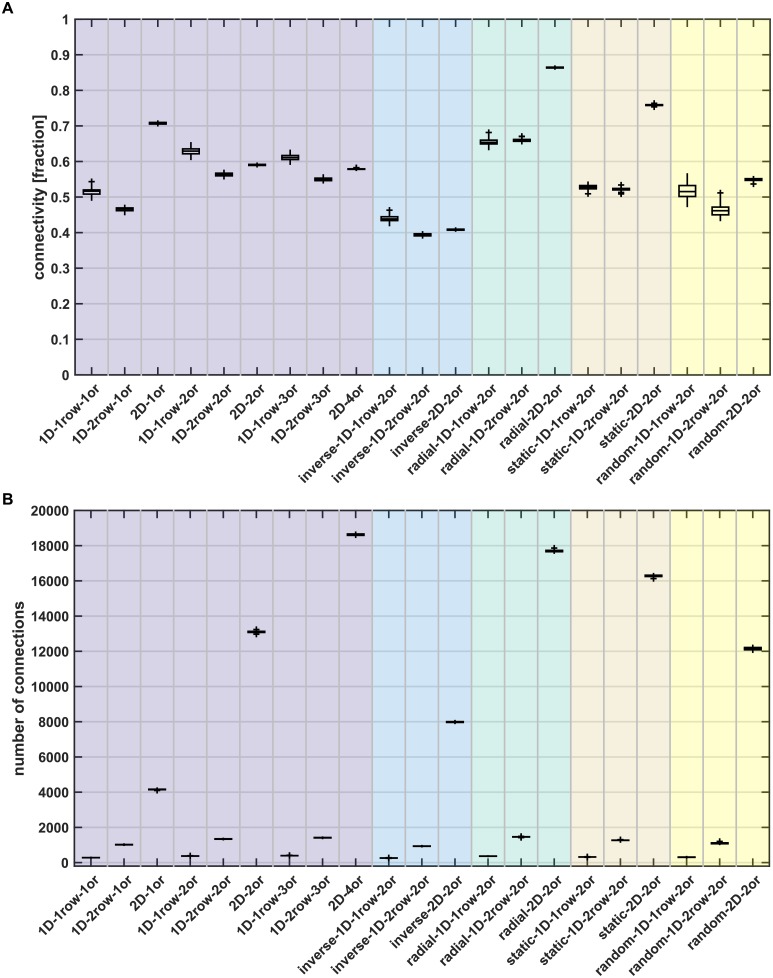
Fig 4. Connection statistics.
(A) Percentage of connected areas, shown as the fraction of possible connections that are present in the final simulated network. (B) Total number of connections among all areas. Box plots show distribution across 100 simulation instances per growth layout, indicating median (line), interquartile range (box), data range (whiskers) and outliers (crosses, outside of 2.7 standard deviations). See Table 3 for a summary. Abbreviations and background colours as in Table 1.

