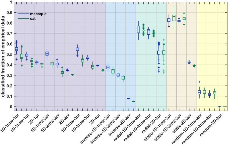
Fig 10. Percentage of empirical connectivity data that were classified from simulation data.
A classifier was trained to predict connection existence of a simulated network from the associated distance and absolute density difference. This classifier was then used to predict connection existence in two species (macaque, blue; cat, green). Here, we show which fraction of the empirical data set was classified. This fraction differs across classification thresholds (see Methods); here, we show the mean fraction across thresholds 0.750 to 0.975. Box plots show distribution across 100 simulation instances per growth layout, indicating median (line), interquartile range (box), data range (whiskers) and outliers (crosses, outside of 2.7 standard deviations). See Table 4 for a summary. Abbreviations and background colours as in Table 1.

