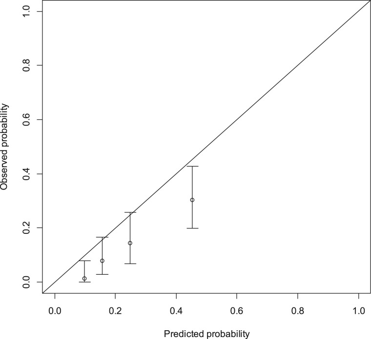
Figure 2.
Calibration plot for external validation of the “Colon Life” nomogram. The nomogram‐predicted probabilities were stratified in equally sized subgroups. For each subgroup, the average 12‐week nomogram predicted probability of death (x‐axis) was plotted against the observed proportion of 12‐week deaths (y‐axis). 95% confidence intervals of the estimates are indicated with vertical lines. The dashed reference line indicates where an ideal nomogram would lie.

