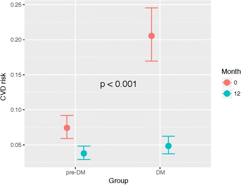
Fig. 2.

Marginal effects plot of the model explaining the relationship between diabetes/pre-diabetes status and CVD risk at baseline and at 12 months. On the X-axis, the two groups of patients are represented for baseline (red) and for month 12 (blue). The Y-axis represents the CVD risk in scale 0–1. P-value refers to the interaction between diabetes status and month
