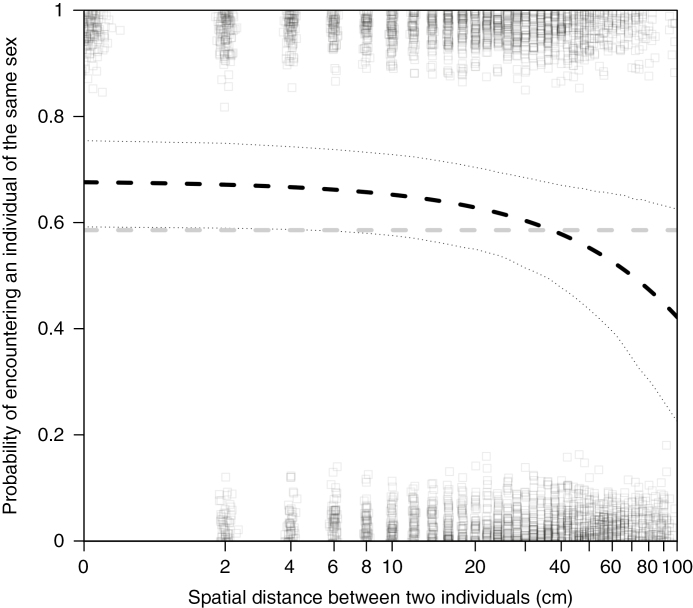
Fig. 2.
As the distance between two individuals increased, the probability that they were the same sex decreased. In our populations, we observed clumping of the sexes, where individuals in close proximity were more likely to be the same sex (dashed black line) than expected in a completely mixed population (dashed grey line). We controlled for the size of the habitat patch and the sex of the focal individual, but these factors did not interact with distance (see Table 3). The black dotted lines are the bootstrapped upper and lower 95 % confidence intervals computed based on 1000 simulations using the bootMer function in the lme4 package (Bates et al., 2014). Boxes are the raw data on whether pairs of individuals were the same sex (y = 1) or the opposite sex (y = 0). We added jitter along both axes to make all the data visible. To be able to plot distance = 0 on a log10 graph, we computed log10(distance + 1) and adjusted the x-axis labels to account for this transformation.

