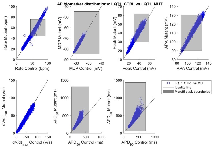
Figure 3.
AP biomarker distributions in the populations LQT1_CTRL vs. LQT1_MUT (blue circles). The black lines represent the identity lines, i.e., when the AP biomarkers are equals in LQT1_CTRL and LQT1_MUT. The grey rectangles represents the boundaries built on the experimental data from the Moretti 2010 [3] control and mutant datasets, obtained in spontaneously beating hiPSC-CMs (see Table 2): lower bound (mean − 2SD) and upper bound (mean + 2SD) for each AP biomarker.

