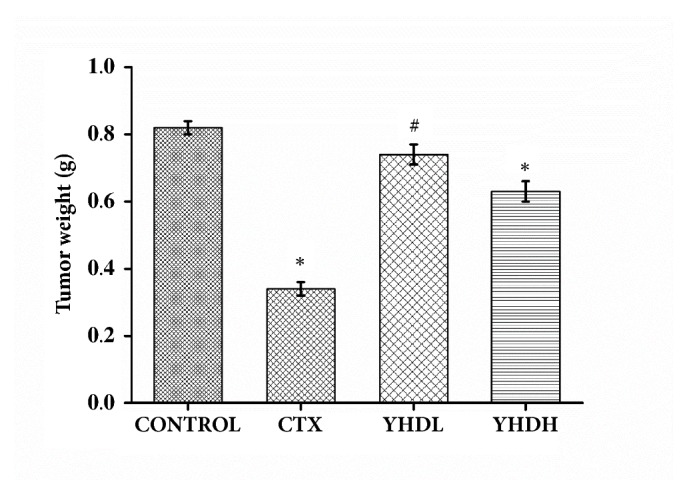
Figure 1.

Tumor weight of the CTX group and different doses of the YHD groups. The bar chart shows the change in tumor weight over medication time. Data are expressed as the mean ± SEM of 8 mouse (∗p < 0.05 compared with the control group).

Tumor weight of the CTX group and different doses of the YHD groups. The bar chart shows the change in tumor weight over medication time. Data are expressed as the mean ± SEM of 8 mouse (∗p < 0.05 compared with the control group).