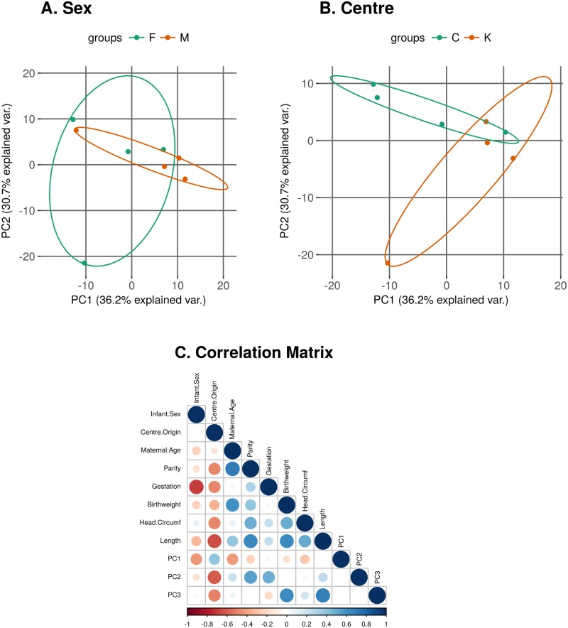
Fig 4. Principal components analysis plots of log-CPM values over PC1 and PC2 showing a 68% confidence ellipse where each point represents a sample.
Samples are coloured and labelled by A: Sex of the infant (M/F) and B: Centre of origin of the samples (C—CUMH; K—KUH). C: Correlation Matrix. Positive correlations (Pearson correlation coefficient (r)) are displayed in blue and negative correlations in red colour. Colour intensity and the size of the circle are proportional to the correlation coefficients. The PCs > 3 each account for less than 10% of the variation in the data and are not shown.

