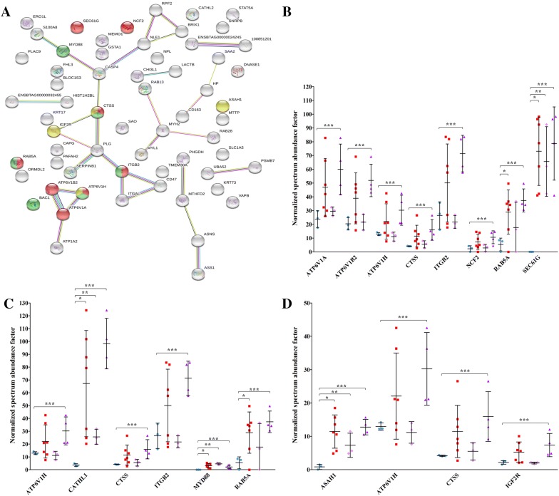
Figure 2.
KEGG enrichment analysis of proteins significantly increased in PTB vs K. The figure reports the protein network and the proteins included in each category, with the respective abundance increases in all PTB samples, in PTB1, and in PTB2, respectively. A Protein network according to STRING. Proteins associated with phagosome, lysosome, and tuberculosis are indicated in red, green, and yellow, respectively. Seven different colored lines link nodes and represent seven types of evidence used in predicting associations. Green lines: neighborhood evidence; red lines: presence of fusion evidence; blue lines: co-occurrence evidence; black lines: co-expression evidence; purple lines: experimental evidence; light blue lines: database evidence; yellow lines: text-mining evidence. Plots show the relative abundances of proteins in the phagosome (B), lysosome (C), and tuberculosis (D) pathways. Plots report values obtained in K (sky blue), PTB (red), PTB1 (pink), and PTB2 (purple) samples. Asterisks indicate statistically significant differences between PTB vs K (*), PTB1 vs K (**), and PTB2 vs K (***) according to the t-test (p value ≤ 0.05). For protein identities corresponding to gene names, please see Table 1.

