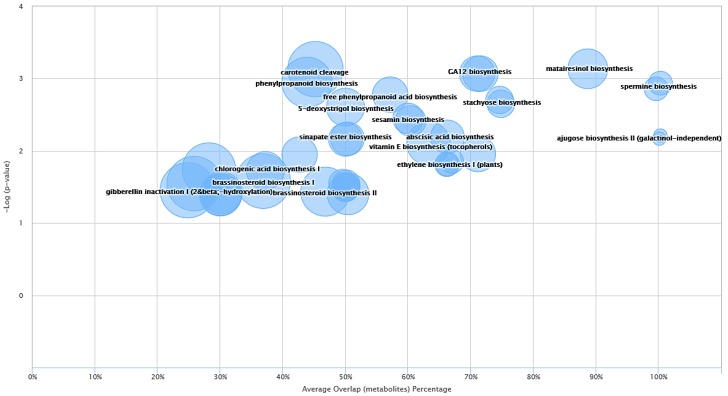
Figure 5.
Metabolic cloud plot depicting the predictive pathway analysis between blue and Manchurian ashes. Each pathway is represented by a circle, the x-axis in the cloud plot represents the percentage of metabolites overlap with in the pathway. The y-axis in the pathway represents the increased pathway significance. The radius of each circle is proportional to the total number of metabolites identified in that pathway. The cloud plot of dysregulated metabolites was generated (p < 0.05) using XCMS bioinformatics platform.

