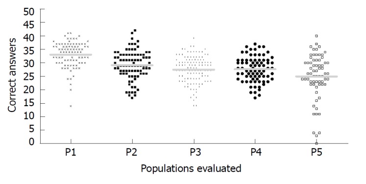
Figure 1.

Distribution of correct answers plotted according to each population evaluated. The y-axis represents the number of correct answers. The solid lines represent the average for P1 (Southeast Viral Hepatitis Ambulatory), P2 (South Health Center), P3 (Northeast Health Center), P4 (Southeast low resource areas) and P5 (Northeast low resource areas), which were respectively: 33.1 ± 4.5; 29.1 ± 5.3; 27.5 ± 5.0; 27.6 ± 4.7; and, 25.0 ± 8.5.
