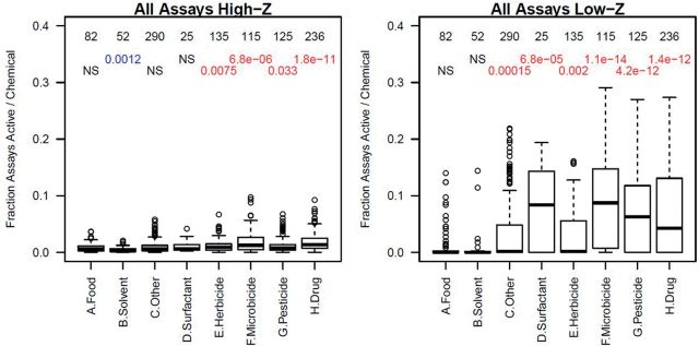
FIG. 4.
Boxplots showing the fraction of assays per chemical with Z > 3 (High-Z, left) and Z < 3 (Low-Z, right) in the aggregated use categories. The number at the top of each column is the number of chemicals in each group. Below that is the t-test P-value comparing the distribution of hit-fractions for each group versus the Food category. In all cases except for Solvents in the High-Z plot, all groups were more active than the Food group. NS indicates that there was no statistically significant difference. In each boxplot, the median is indicated by the dark horizontal line; the second and third quartiles by the box; the 95th percentile by the whiskers; and outliers by the circles.

