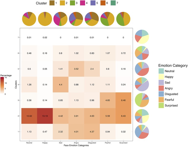
Figure 4.
The heat map depicts percentages of all face stimuli in each of the seven face categories for each cluster obtained from hierarchical clustering analysis (cut off at seven clusters) of Taiwanese participants' multi-dimensional ratings. The pie charts represent the marginalized proportions of composition within each cluster (next to each row of the heat map) or face emotion category (above each column of the heat map).

