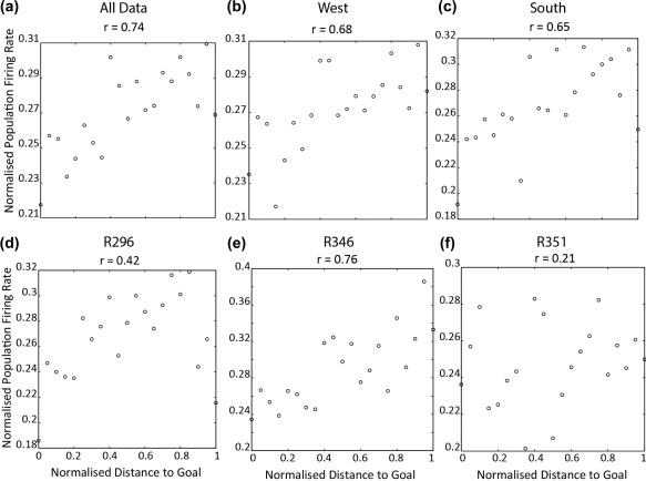
Figure 3.

Distance‐to‐goal modulation on population rates. Scatterplot of population rates against normalized distance to goal. x axis shows distance to goal, and y axis the normalized population rates. The title of each plot shows the correlation between rates and distance. (a) Average population rates across goal distance for all data. (b) Average population rates across goal distance for all data where animal to west goal well, (c) same as (b) but for south goal well. (d–f) Population rates across distance to goal for R296, R346, and R351, respectively
