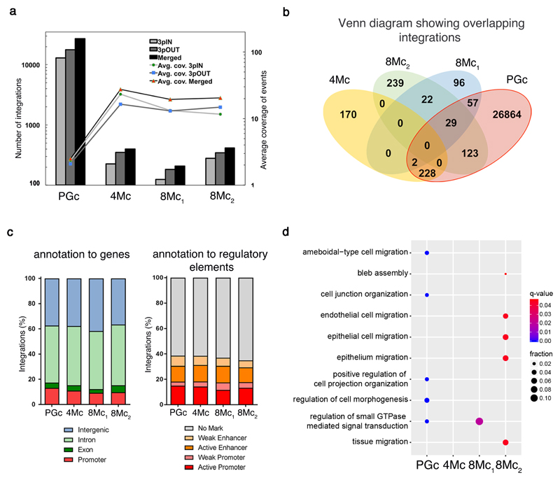
Figure 3. Integration profile of transgenic epidermis.
a, Integrations were identified in libraries obtained using two LTR-primers (3pIN, light grey bars; 3pOUT, dark grey bars; Supplementary Table 1) and in the merged set (black bars). Lines (secondary axis) depict the average integration coverage, calculated after removal of PCR duplicates. b, Venn diagram of the number of shared integrations across samples. c, percentage of integrations mapped to: promoters, exons, introns, and intergenic regions (left); epigenetically defined active and weak promoters and enhancers, or genomic regions with no histone marks (right); (p-value>0.05; Pearson's Chi-squared test). d, Dot plot of the top 5 enriched GO Biological Process terms for each sample. Dot colour indicates statistical significance of the enrichment (q-value); dot size represents the fraction of genes annotated to each term.

