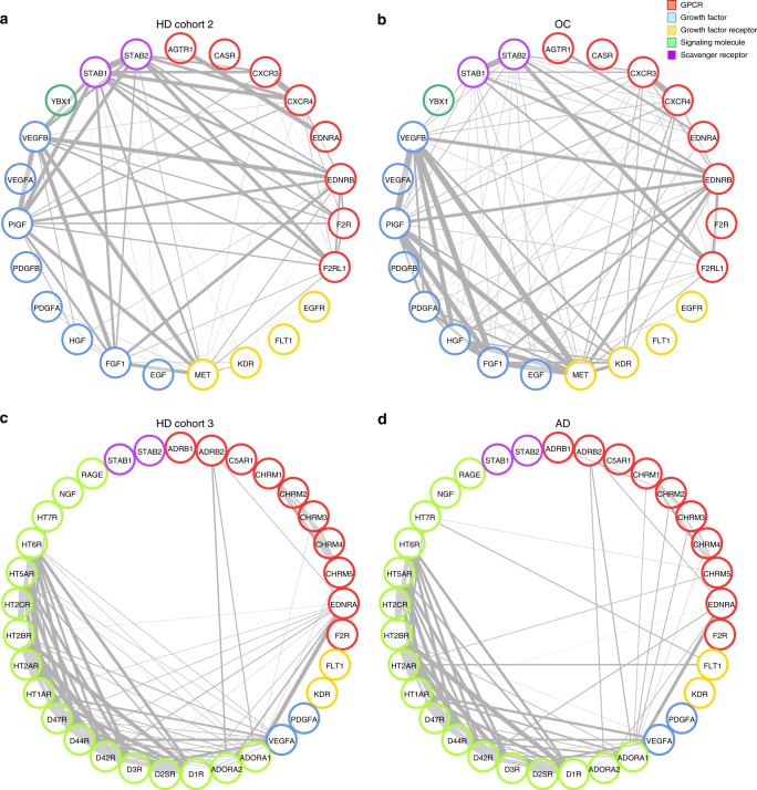
Fig. 3.
Effects of ovarian cancer and Alzheimer’s disease on autoantibody correlations. Graphics display the comparisons of a healthy donors (HD) and patients with b ovarian cancer (OC; Supplementary Table 1, cohort 2; Supplementary Table 2, aab dataset 2) and c HD and patients with d Alzheimer’s disease (AD; Supplementary Table 1, cohort 3; Supplementary Table 2, aab dataset 3). The nodes in the graphs represent variables (each aab), and a line between two nodes indicates the Spearman’s rank correlation coefficient. The line width indicates the strength of the association, with stronger correlations indicated by thicker lines. Only correlations >0.6 are shown. Multiple connections of nodes indicate clustering

