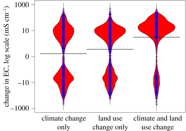
Figure 6.

Comparison of the amount of change between current and end of century EC if only climate variables are changed (left), if only land use is changed (centre), and if both climate and land use change (right). Red areas indicate the density of the data, blue lines are a 1-D scatter plot, and black lines indicate group means. Note that the apparent bimodal nature of the data is an artefact of plotting on a log scale.
