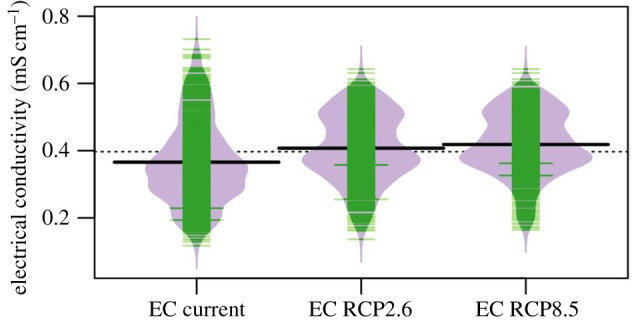
Figure 3.

Bean plot of EC current values (2005–2015) and forecast values (2070–2100) in RCP 2.6 and RCP 8.5 scenarios. Thin lines give individual data points, with the length of the line indicating the relative frequency; the thick black lines gives the mean values per group; the dashed black line gives the mean value over all groups. (Online version in colour.)
