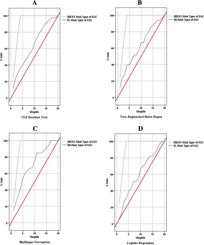
Fig. 1.
The gains charts of the four models. The top polygonal line is ideal curve, and the irregular curve is gains curve of a model between the ideal curve and the diagonal. For a good model, the gains curve will rise steeply toward 100% and then level off. A model that provides no predictive performance will follow the diagonal from lower left to upper right. As shown in this figure, the gain curves of the three data mining models (image a, b and c) were convexes close to the ideal curves, especially the MLP model. However, the gain curve of the LR model (image d) rose slowly away from the ideal curve

