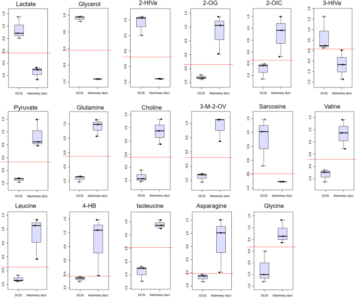
Supplementary Fig. 5.
Box and Whisker plots of the 17 metabolites identified as potential biomarkers using classical univariate ROC curve analysis. The top and bottom whiskers show the highest and lowest data points, respectively. The top and bottom grey boxes describe the upper and lower quartile, respectively, while the dark black line inside the box shows the median of the data. Red lines depict the optimal classification cut-off. All metabolites included had AUC = 1 and fold change > ±0.5. N = 3 biological replicates per sample group.

