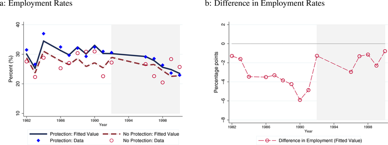
Figure 5: Disabled Workers’ Employment Rates Before and After the ADA.
Note: Figures 5a and 5b illustrate the estimation results of employment rates. Circle (red) and diamond (blue) markers in Figure 5a represent the average employment rates of the treatment and control groups, respectively. The lines indicate the average estimated employment rates based on the estimation. Figure 5b shows the difference in these employment rates.

