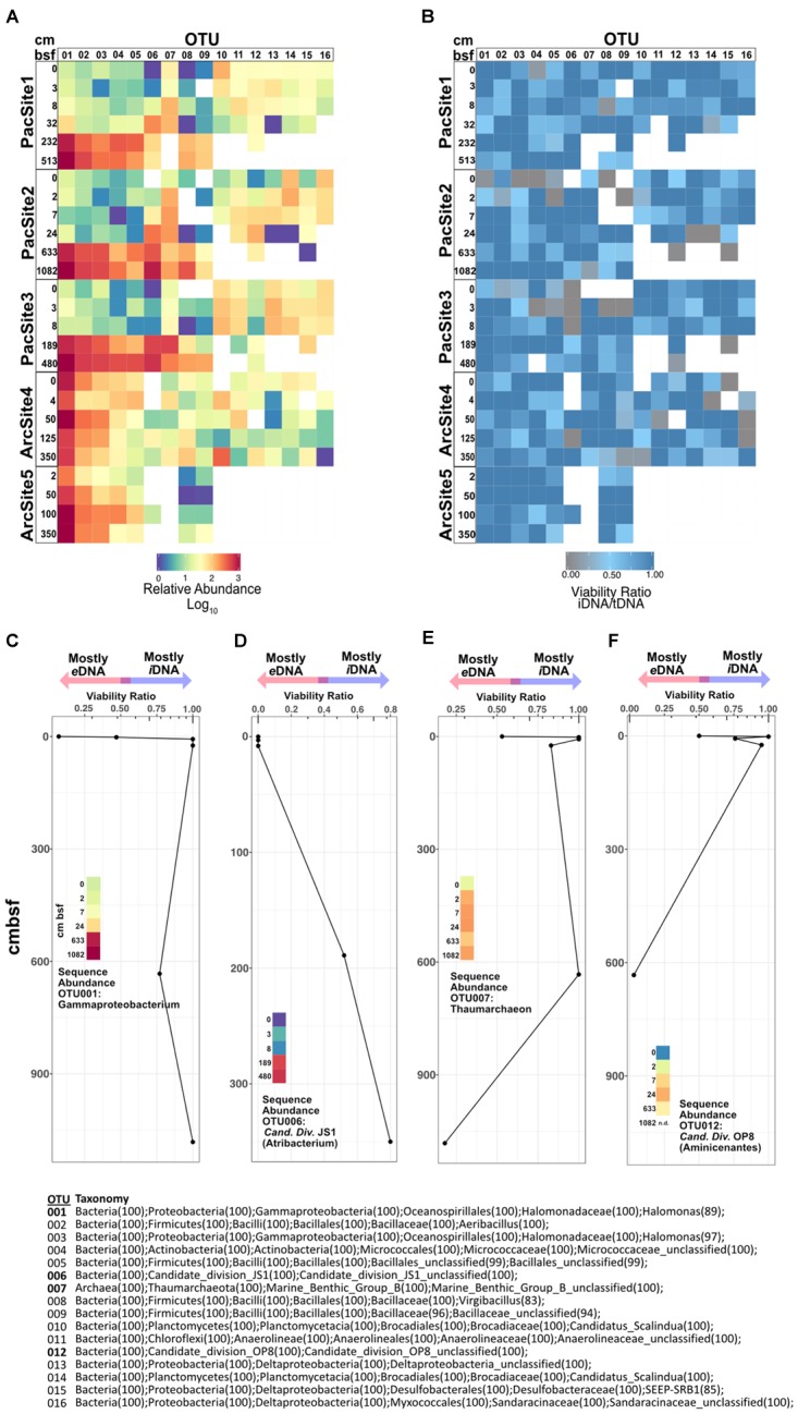
FIGURE 6.

(A) Heat map of relative sequence abundance for the 16 most abundant OTUs. (B) Heat map depicting viability ratios for the 16 most abundant OTUs in our dataset. Combined viability ratio and sequence abundance for OTUs (C) 001, (D) 006, (E) 007, and (F) 012. Color scale for sequence abundance in panels C-F is the same as that in panel A. Bottom center list shows taxonomic assignments of all depicted OTUs above.
