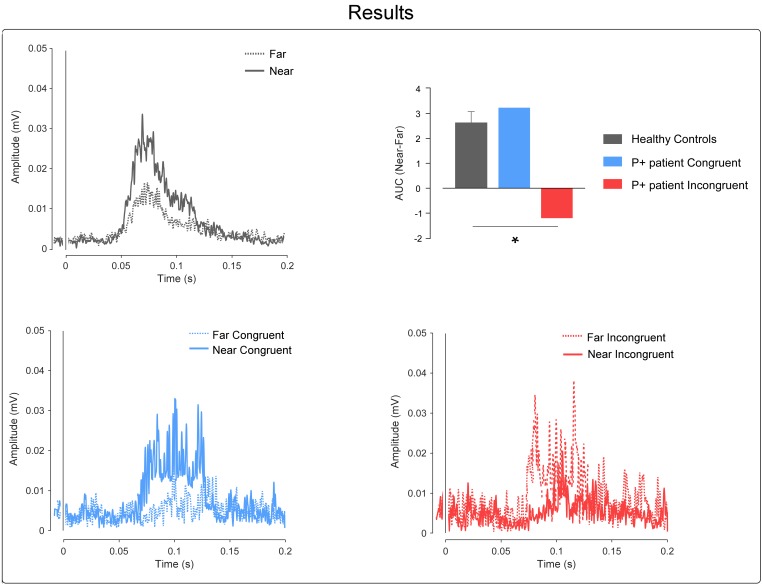
FIGURE 3.
Results. Top-left, the graph shows the control’s group-average rectified HBR waveforms; x-axis, Time (ms); y-axis EMG activity (mV). Top-right, the graph shows the AUC expressed as a difference between the near and far positions; in the controls group, we plotted the mean group AUC and error bar representing the standard error of the mean (SEM). The asterisk represents the results of the Crawford’s test (∗ = p < 0.05). Bottom, the graphs show the P+ patient’s rectified HBR waveforms in the congruent and incongruent conditions, respectively; x-axis, time (ms); y-axis EMG activity (mV).

