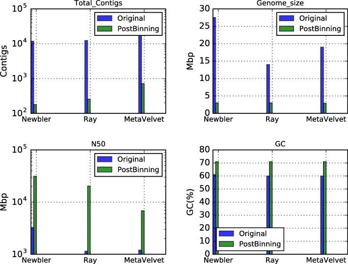
Fig. 9.
Comparative assembly of the thermal metagenome (before and after binning). The upper left graph shows the number of contigs produced using all the reads (blue bar) versus the contigs produced from CLAME’s biggest bin (green bar). The upper right graph shows the expected genome size. The lower left graph shows the N50 estimation. And the lower right graph shows the GC-percentage for the produced contigs

