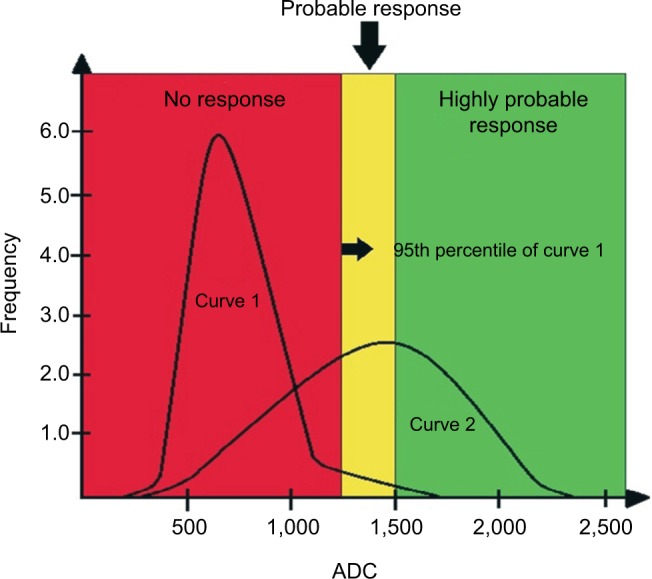
Figure 8.

Illustrative diagram showing curves of hypothetical histogram analysis before treatment (Curve 1) and after treatment (Curve 2), the latter showing a partial therapeutic response.
Notes: The curves are divided into three tracks: one above 1,500 µm2/s, another between 1,500 µm2/s and the 95th percentile of the baseline (pre-treatment) curve, and the third one below the 95th percentile. The range above 1,500 µm2/s is considered as a response with tissue necrosis (highly probable response to the treatment), the intermediate range as microscopic cellular necrosis (likely response), and the range below the 95th percentile as viable tumor tissue (absence of response). The red area under Curve 2 corresponds to pixels of metastatic lesions without response to the administered treatment, ie, with viable neoplastic tissue. The yellow and green areas under Curve 2 correspond to pixels of metastatic lesions with a likely and highly likely response, respectively.
Abbreviation: ADC, apparent diffusion coefficient.
