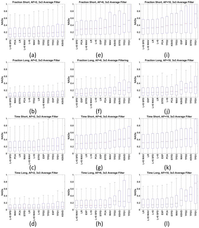
Figure 7.
Box plot of the NAD for all human knee cartilage datasets with 3×3 averaging filter for AF=2 (a) fraction-short, (b) fraction-long, (c) T1ρ-short, (d) T1ρ-long, (e)–(h) AF=6 and (i)–(l) AF=10. The box plot shows more information about the NADs than only the MNAD. The horizontal red bars represent the median of NAD (or NMAD), the blue box represent the central interquartile, where MAD values from percentile 25% to 75% are placed. The dashed dark lines represent the range of the data.

