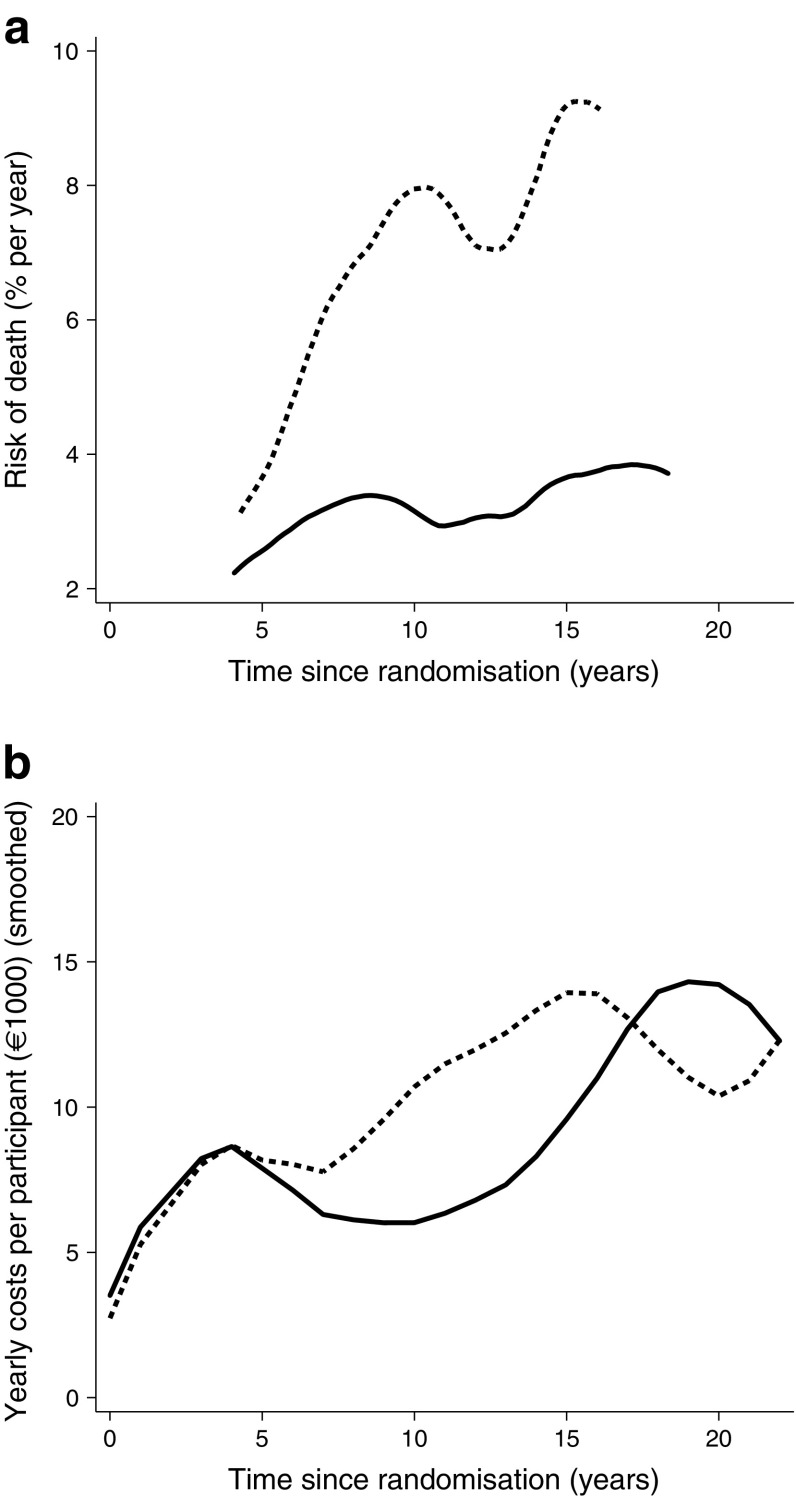
Fig. 2.
(a) Risk of death in the intensified therapy group (solid line) and in the conventional therapy group (dashed line). The graphs are plotted to start after baseline and are truncated before the end of follow-up because no deaths occurred in those periods, hence the hazard was not calculated. (b) Yearly direct health costs (as in Fig. 1), with data smoothed. Comparing the two graphs shows similar trends (with allowance for minor delay in the cost curve because of the way data were collected). Increasing mortality is followed closely by increased expenditure, reflecting increased morbidity prior to death

