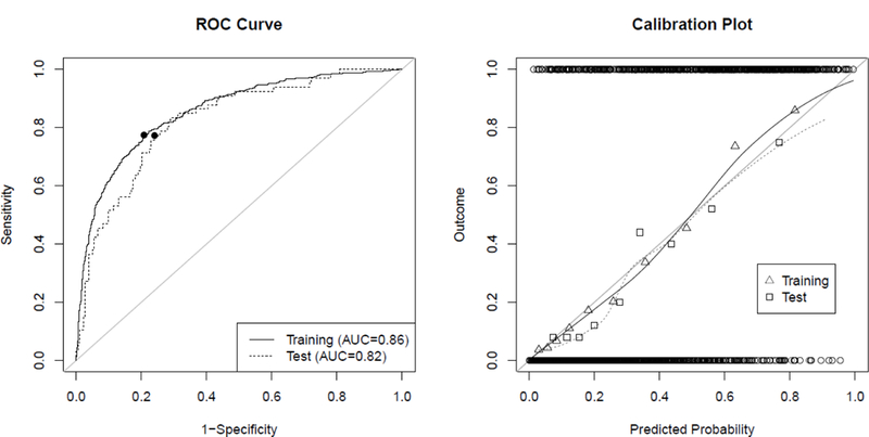
Fig. 3.

ROC-curves and calibration plots for the training data (solid line) and combined AneuX and AneuRisk data (“test”, dotted line). (Left) ROC curves visualize the discriminative ability of the model. The filled circles on the ROC curve indicate the values corresponding to the “optimal threshold” determined for the respective data. (Right) Calibration plots allow to assess the goodness-of-fit of the model. The circles at the top and bottom show the observed data. The triangles and squares show the observed outcomes of the training and test populations grouped by deciles, which are also represented by the loess smoother with the solid and dotted line. For a perfectly calibrated fit, all triangles/squares and the loess smoother would lie on the 45°-line
