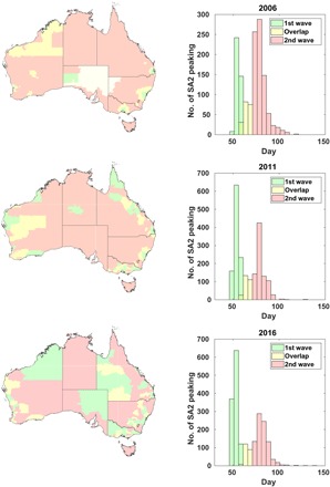
Fig. 2. Maps and histograms demonstrating geographic and temporal bimodality in epidemic spread.

The histograms represent the number of statistical areas (SA2) experiencing peak disease prevalence on a given day. The colors correspond to heuristic classification; green bars indicate the first wave, yellow bars are undetermined, and red bars indicate the second wave. The colors on the map correspond to those in the histogram and demonstrate the geographic distribution of each pandemic wave.
