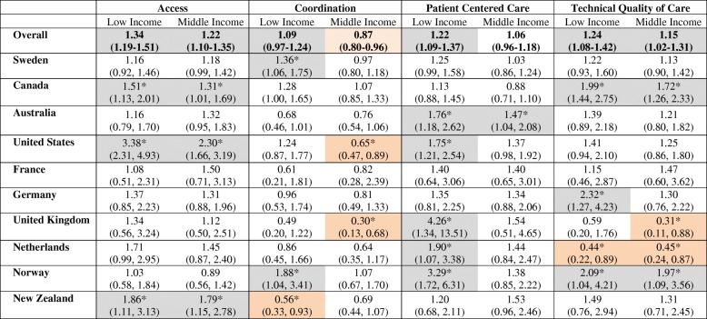
Table 3.
Odds of reporting “poor” care for low and middle income categories relative to upper income category – adjusted for number of individuals in the household
Adjusted for number of individuals in household
Statistically significant results are indicated by a “*”. Within these, results representing worse care for those in the high income group are shaded light orange, whereas those representing worse care for lower income groups are shaded light grey

